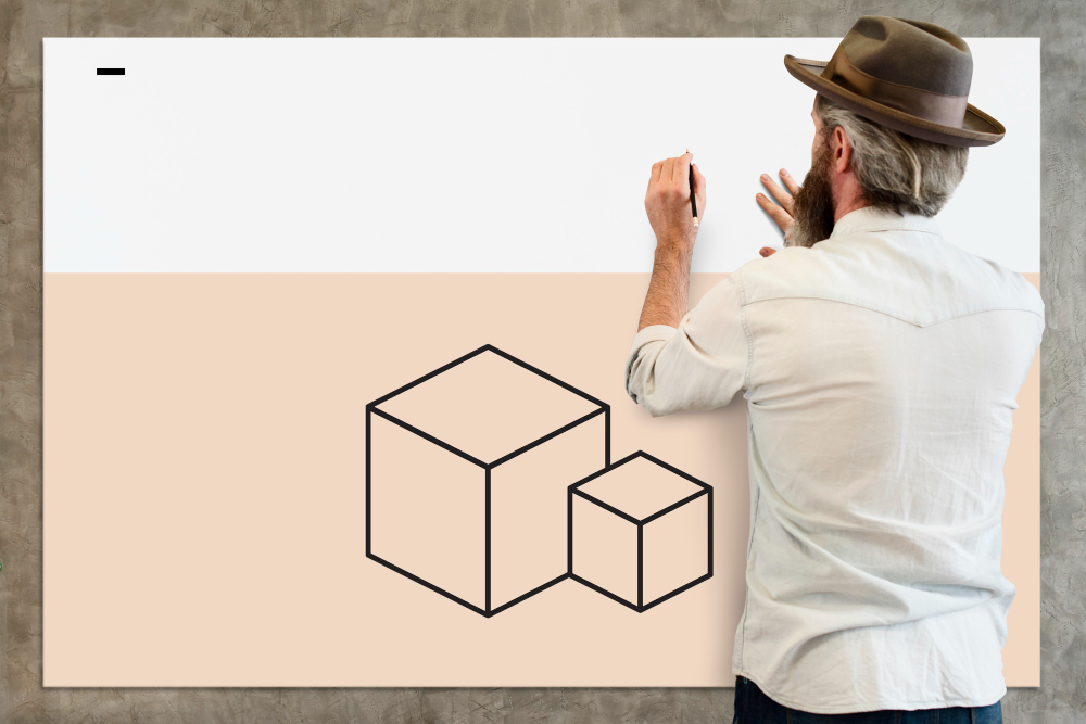
Web design is more than just choosing colors and fonts; it’s a complex dance of visual cues, spatial arrangements, and subconscious principles that guide how users perceive and interact with a site. While much of what makes a website look polished and professional is immediately visible—such as typography choices or color schemes—the underlying spatial principles often work invisibly. These invisible geometries shape the user experience in subtle yet powerful ways, creating harmony, focus, and flow without drawing explicit attention. Let’s explore how these unseen foundational elements influence effective web design.
The Hidden Foundations of Symmetry and Balance: How Geometric Alignment Creates Visual Harmony and Guides User Attention
Symmetry and balance serve as the invisible scaffolding of a well-designed website. When elements are aligned with geometric precision, they create a sense of order and harmony that feels instinctively satisfying. This isn’t accidental; designers deliberately employ principles like central alignment, mirrored structures, and proportional spacing to craft visuals that are aesthetically pleasing and psychologically comfortable.
For instance, balanced layouts distribute visual weight evenly across the page, preventing any one area from feeling overly crowded or empty. Symmetry provides a sense of stability—it’s what makes a homepage appear solid and trustworthy. More subtly, alignment guides the user’s eye along a natural reading path, from headlines to subtext, images to call-to-actions, ensuring a smooth flow without requiring conscious effort.
By understanding and leveraging these geometric arrangements, designers create an environment where content feels intuitively organized, helping users process information effortlessly. When users don’t have to consciously search for navigation cues or struggle to find the focal point, their experience is more seamless, engaging, and trustworthy—key ingredients for successful digital interactions.
The Subtle Power of the Rule of Thirds and Golden Ratios in Creating Aesthetic Anchors and Focal Points That Capture and Hold User Attention
The rule of thirds and the golden ratio are timeless principles that evoke a natural sense of harmony—principles that are often invisible within the layout but work tirelessly in the background. These ratios serve as invisible anchors that subtly influence where viewers’ eyes land first, second, and third.
In practical terms, placing key images or headlines along imaginary lines or at intersections defined by these ratios enhances the aesthetic appeal and draws attention without overt cues. For example, positioning the hero image’s focal point at a third of the way down the page or aligning a call-to-action button slightly off-center can unnoticeably increase engagement by aligning with natural human visual tendencies rooted in these mathematical proportions.
This subtle structuring ensures that every element feels intentionally placed, imparting a sense of order that’s both pleasing and familiar. The beauty of these principles lies in their invisibility—they work beneath the surface, creating visual anchors that guide attention naturally, encouraging users to explore content and respond with heightened interest.
Invisible Grids and Modular Structures: How Non-Obvious Frameworks Organize Content and Enhance User Navigation Seamlessly
Behind the sleek interface of modern websites are invisible grid systems—subtle frameworks that organize content systematically. These grids aren’t always visible on the surface but act as the blueprint for aligning text blocks, images, menus, and other components.
Using unseen grid structures allows designers to maintain consistency and clarity. For example, a 12-column grid ensures that elements align perfectly across various sections and devices, creating a cohesive look and feel. It facilitates responsive design, where content adapts fluidly to different screen sizes, without appearing disorganized or chaotic.
Modular structures complement grids by breaking down complex content into manageable, reusable units—think of card-based layouts or content blocks—that can be rearranged across pages or devices while maintaining visual harmony. These frameworks streamline navigation, reduce cognitive load, and foster trust because users intuitively recognize patterns and predictability.
Understanding and utilizing these hidden geometric frameworks helps craft websites that feel natural to navigate—guiding users seamlessly through information layers while maintaining aesthetic consistency—even without explicit visual cues.
The Role of Negative Space as an Invisible Boundary and Balancing Element That Creates Breathing Room and Focus in Design
Negative space, often misunderstood as mere emptiness, plays a crucial role as an invisible design element that balances the entire composition. It acts as a soft boundary, separating different sections and ensuring that content doesn’t feel cramped or overwhelming.
Proper use of negative space enhances readability, directs focus, and creates an elegant visual rhythm. For example, generous whitespace around a headline emphasizes its importance, while spacing between navigation links makes browsing effortless. These “breathing areas” allow users’ eyes to rest and process content comfortably.
From a subconscious perspective, negative space influences perceptions of sophistication and professionalism. It makes the content feel curated rather than cluttered, lending a sense of trustworthiness and quality. Thoughtful application of negative space is an invisible tool that stabilizes compositions and highlights key elements, fostering user engagement and retention through clarity and aesthetic appeal.
The Impact of Invisible Curves and Flowlines in Guiding User Journey and Creating a Natural Visual Path Through Content
Lastly, while grids and structured layouts provide stability, subtle curves and flowlines introduce a sense of movement and rhythm, guiding users gently across a page. These flowing lines may be implied through the arrangement of elements, curved shapes, or visual cues like arrows and pathways.
Invisible to the eye, these curves serve as visual highways, leading viewers’ gaze from one focal point to another—say, from a headline, through supporting images, toward a call-to-action. They evoke a natural, almost organic, flow that mimics human visual habits—following the gentle arc of a winding trail or the rhythm of a melody.
In storytelling websites or portfolios, these hidden flowlines help create an immersive experience, making the interaction feel effortless and engaging. When expertly integrated, they elevate static designs into dynamic narratives—guiding users intuitively from curiosity to conversion, all without overt instructions.
In conclusion, web design is as much about invisibly orchestrated spatial principles as it is about visible aesthetics. Recognizing and harnessing these subtle geometric truths—symmetry, ratios, grids, negative space, and flowlines—can profoundly impact user experience, making digital spaces feel more natural, intuitive, and compelling. When designers go beyond surface appearances and tap into these invisible geometries, they craft websites that resonate on a subconscious level, transforming mere visual arrangements into harmonious journeys.