In the rapidly evolving digital landscape, the importance of visual communication cannot be overstated. Fonts, often overlooked as mere aesthetics, play a pivotal role in shaping how users perceive, interpret, and interact with digital interfaces. While machines process text through algorithms and character recognition, humans experience fonts on an emotional and cognitive level. Understanding this duality—the mechanical and the emotional—can transform the way designers craft interfaces that are both functional and engaging. In this article, we explore the intricate relationship between fonts, machine readability, and human perception, highlighting how typography influences user experience.
The Technical Backbone: How Machines Read Fonts
Before delving into human perception, it’s essential to understand how machines interpret fonts. Digital text is primarily processed through character encoding and font rendering systems. Unicode, for example, assigns unique code points to every character, allowing computers to recognize and display text consistently across devices.
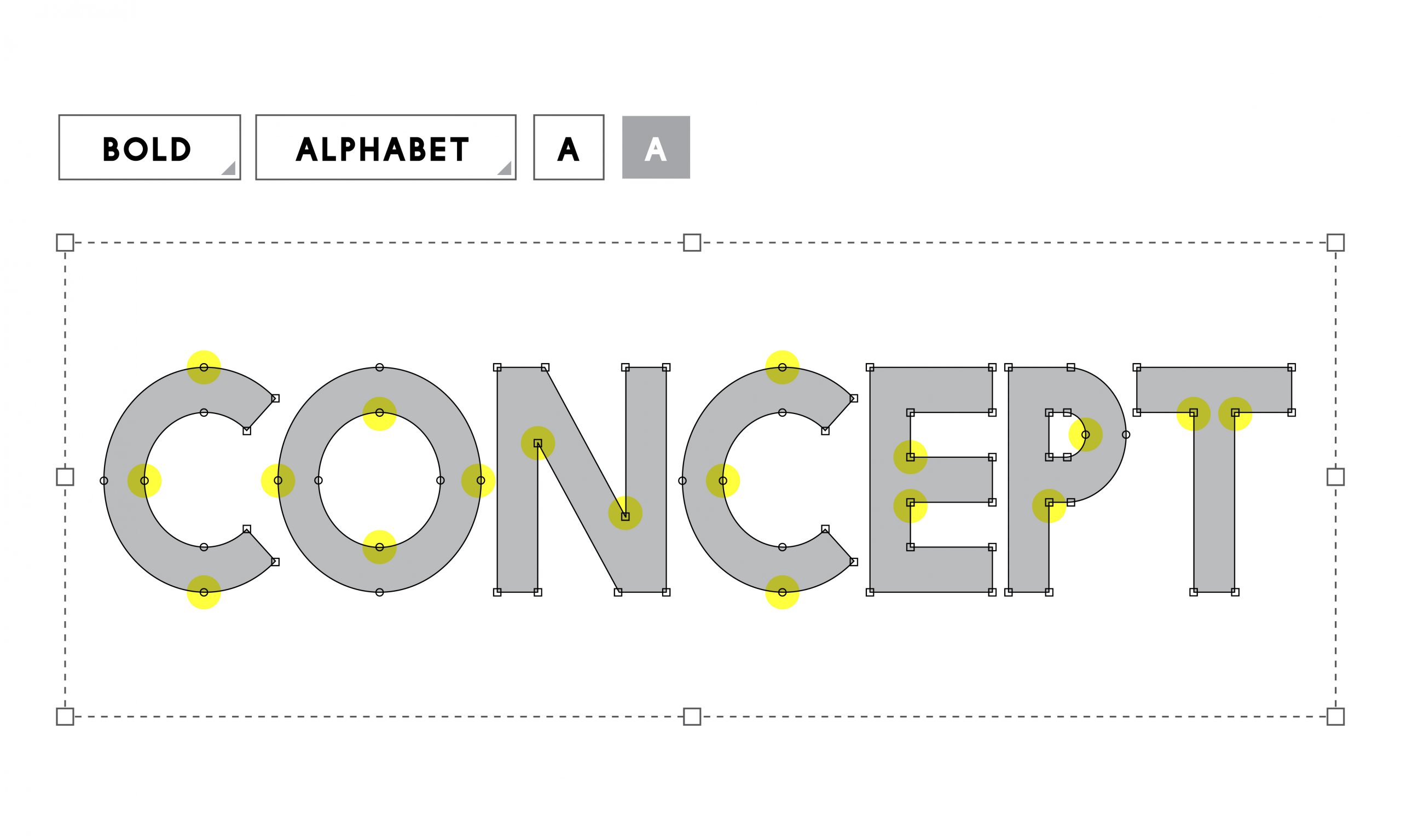
Font rendering engines, such as those in browsers or operating systems, translate these code points into visual representations by referencing font files—like TrueType or OpenType font formats—that contain vector outlines of characters. This process involves several steps:
- Character Recognition: The system identifies each character based on its code point.
- Glyph Selection: It retrieves the specific shape (glyph) associated with that character from the font file.
- Rendering: The glyph is rendered on the screen, scaled and spaced appropriately.
Modern machine learning models even go beyond basic recognition to infer font styles, weights, and handwriting, enabling tasks like font identification or handwriting recognition. Despite these advanced capabilities, the core goal for machines remains accurately reading and rendering text without error.
However, machines do not perceive emotional nuance; they interpret fonts as data points. Their primary focus is on fidelity—how precisely text can be read and processed. This underscores a fundamental dichotomy: while machines prioritize clarity and consistency, humans bring a wealth of emotional and contextual interpretation to the fonts they see.
The Human Dimension: Fonts as Emotional and Cognitive Cues
For humans, fonts are much more than characters on a screen—they are powerful cues that influence perception, mood, and behavior. The way text is styled, spaced, and colored can evoke specific feelings and associations, shaping the overall user experience.
Conveying Tone and Personality
Different fonts carry inherent personality traits. Serif fonts like Times New Roman evoke tradition, reliability, or authority, making them popular in formal documents and newspapers. Sans-serif fonts like Helvetica or Arial suggest modernity, simplicity, and clarity—common choices for tech interfaces and minimalist designs. Script fonts can feel elegant or personal, often used in invitations or branding for luxury products.
Readability and Ease of Use
Typography impacts how easily users read and comprehend information. Factors such as font size, line spacing, and letter spacing influence readability. For instance, overly decorative fonts might attract attention but hinder quick reading, whereas clean, well-spaced fonts facilitate effortless skimming and comprehension. Accessibility considerations emphasize the importance of clear fonts to accommodate users with visual impairments or reading difficulties.
Emotional Resonance and Engagement
Fonts can evoke emotional responses. Comic Sans, despite its playful appearance, is often viewed as unprofessional, while a sturdy, bold font can convey strength and confidence. Choice of font can reinforce branding messages or influence user trust. For example, a financial website might select a conservative font to communicate stability, while a startup app might opt for a fresh and energetic typeface to attract younger audiences.
Cultural and Contextual Nuances
Perception of fonts is also influenced by cultural context. A font perceived as fashionable or serious in one culture might have different connotations elsewhere. Designers need to be culturally aware to ensure that typography aligns with the target audience’s expectations and sensitivities.
Bridging the Gap: Designing Interfaces that Are Both Machine-Readable and Human-Friendly
Achieving seamless interaction between machine processing and human perception requires thoughtful typography design. Here are key considerations for creating effective digital interfaces:
Prioritizing Clarity and Consistency
Using web-safe fonts and adhering to accessibility standards ensures that text is reliably readable across devices and by all users. Choosing high-contrast color schemes and adequate font sizes enhance legibility.
Balancing Aesthetics and Functionality
While creative fonts can add personality, they should not compromise readability. Combining a distinctive headline font with a more neutral body text font often achieves this balance.
Considering Emotional Impact
Font choices should align with the brand’s tone and the message’s purpose. For instance, a health app aimed at calming users might employ soft, rounded typefaces, whereas a tech security platform might prefer sleek, rigid fonts to suggest safety and stability.
Testing Across Devices and Contexts
The visual rendering of fonts can vary across browsers and devices. Testing ensures that typography maintains its intended effect and readability in various environments.
Future Directions: Emerging Technologies and the Evolution of Typography
Advancements in AI and machine learning are opening new horizons for personalized and adaptive typography. For example, interfaces could dynamically adjust fonts based on user preferences, psychological states, or environmental contexts. Brain-computer interfaces might one day interpret subtle emotional responses to fonts, allowing designers to craft truly emotionally resonant text.
Moreover, innovations in variable fonts enable real-time modifications of weight, width, and style within a single font file, providing unprecedented flexibility. As digital interfaces become more immersive with AR and VR, typography will evolve to accommodate three-dimensional and spatial presentation, further blurring the lines between machine readability and human perception.
Conclusion
Fonts are a silent yet powerful component of digital communication, serving as an interface bridge between machines and humans. While machines rely on precise rendering and recognition, humans experience fonts on an emotional and cognitive level, shaping perceptions and interactions. Recognizing this interplay allows designers to create interfaces that are not only technically effective but also emotionally engaging and accessible.
As technology advances, the harmonious integration of machine readability with human feelings promises to deliver more intuitive and expressive digital experiences. The challenge lies in balancing the technical demands of clarity and consistency with the human desire for connection, personality, and trust—ultimately demonstrating that in typography, what looks simple on the surface can hold layers of depth and meaning beneath.